Building a design system at scale: Breaking down components
2024
Introduction
Welcome back to the second part of my deep dive into design systems. In Part 1, I shared my approach to the foundational elements of design systems: design tokens, atomic components, and UI elements. Now, I want to delve into more advanced concepts that I've grappled with in my work, including component variants, the challenges of maintaining consistency while allowing for flexibility, and strategies I've developed for handling edge cases in design systems.
Component Variants: Flexibility Within Structure
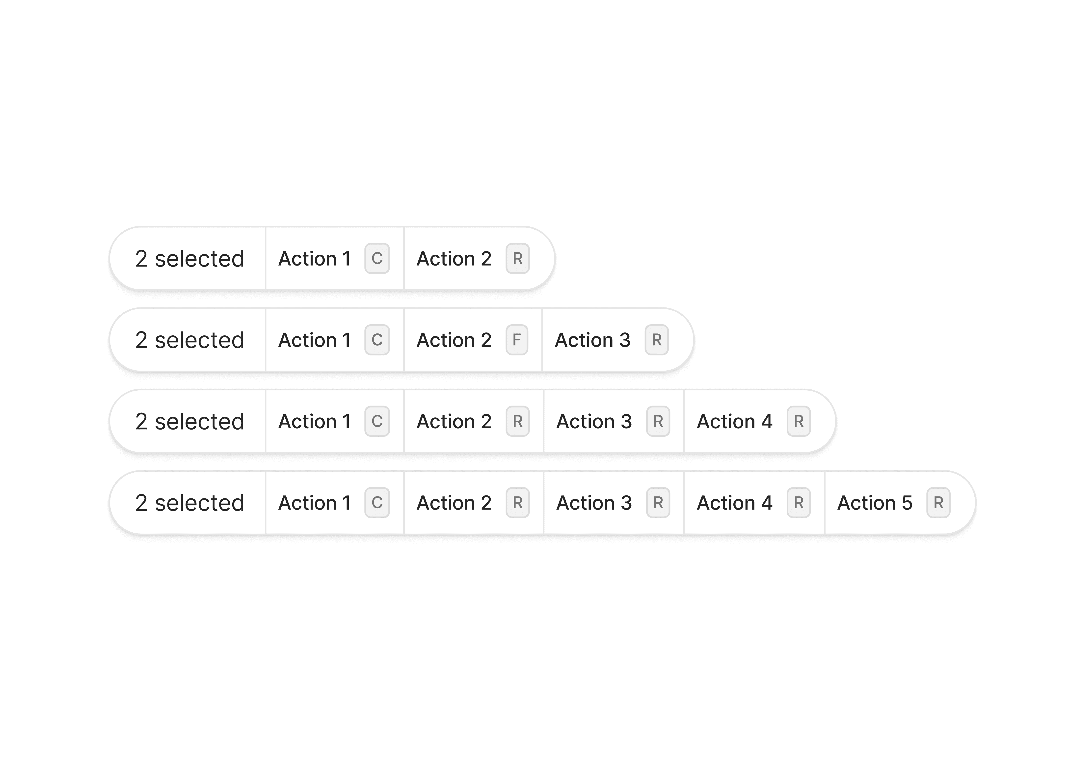
One of the key challenges I've faced in working with design systems is balancing consistency with the need for flexibility. In my experience, component variants are a powerful tool for addressing this challenge.
Understanding Component Variants
I define variants as variations of a component that share the same basic structure but differ in specific attributes. They allow for flexibility within the constraints of the design system.
The Power of Variants
In my work, I've found that component variants offer several benefits:
Consistency with Flexibility: Variants ensure that components maintain a consistent base structure while adapting to different contexts.
Efficient Design and Development: Instead of creating entirely new components for each use case, I can work with pre-defined variants, and I've found that developers appreciate this approach too.
Improved User Experience: In my observation, users benefit from consistent interaction patterns across different parts of the application, even when the specific actions vary.
Scalability: As new use cases arise, I can add new variants without disrupting the existing system.

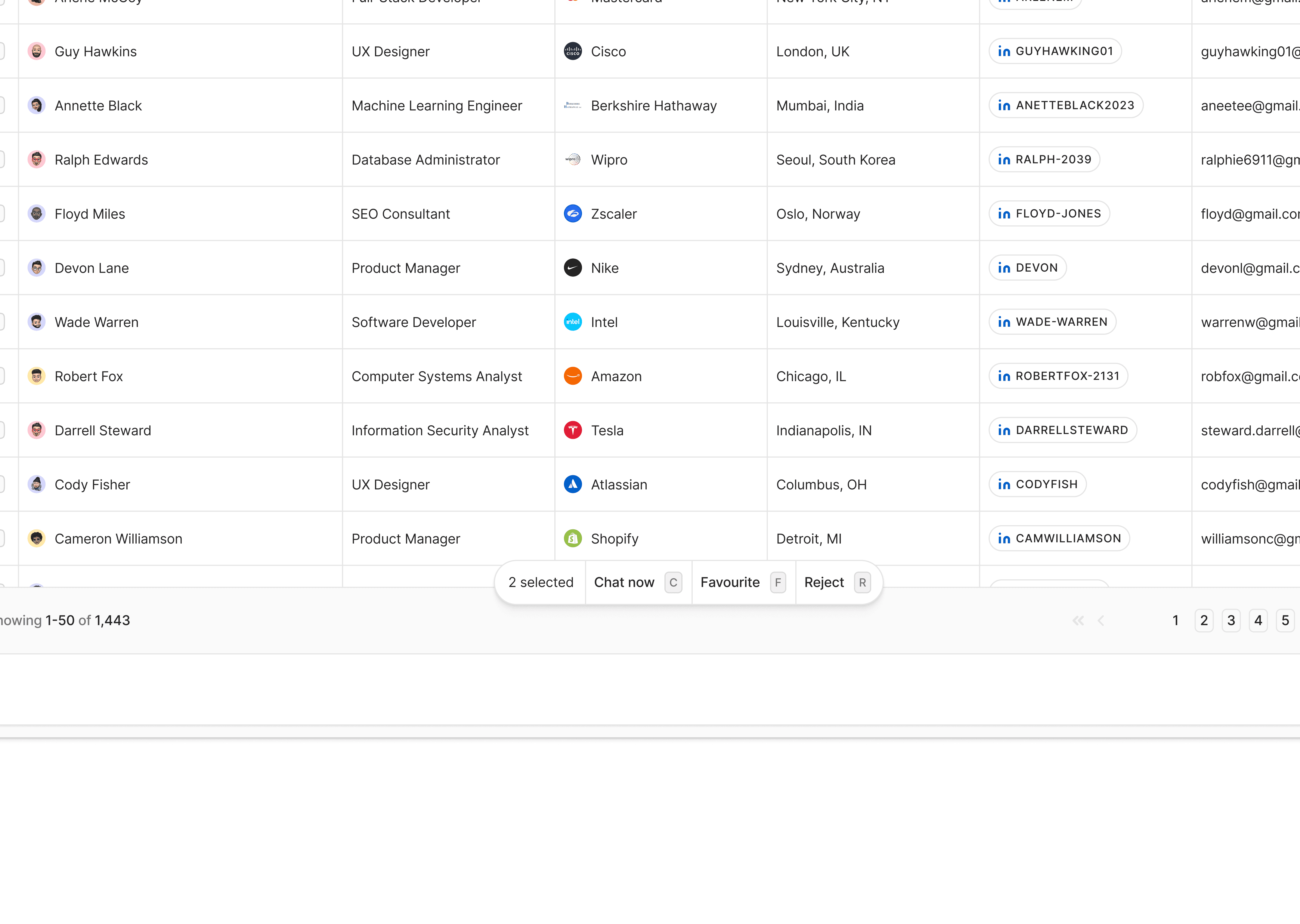
While atomic components and simple UI elements form the foundation of the design systems I create, real-world applications often demand more complex components.
Layering in a Complex UI Component
Even in complex components like this, I ensure our layering principle is at work:
Design Tokens: I use our established colors, typography, spacing, and other fundamental values
Atomic Components: I incorporate our system's buttons, input fields, and icons
UI Elements: I compose the action button group and individual list items from our atomic components Complex Component: The entire user list becomes a composition of multiple UI elements and atomic components
This layered approach ensures that even our most complex UI components maintain consistency with the overall design system. It's a strategy that has served me well in maintaining coherence across large-scale applications.

Breaking Points: When Components Need to Deviate
Despite my best efforts to create comprehensive design systems, I've encountered situations where standard components don't quite fit the need. I call these "breaking points" - instances where we need to deviate from our established patterns.

Identifying Breaking Points
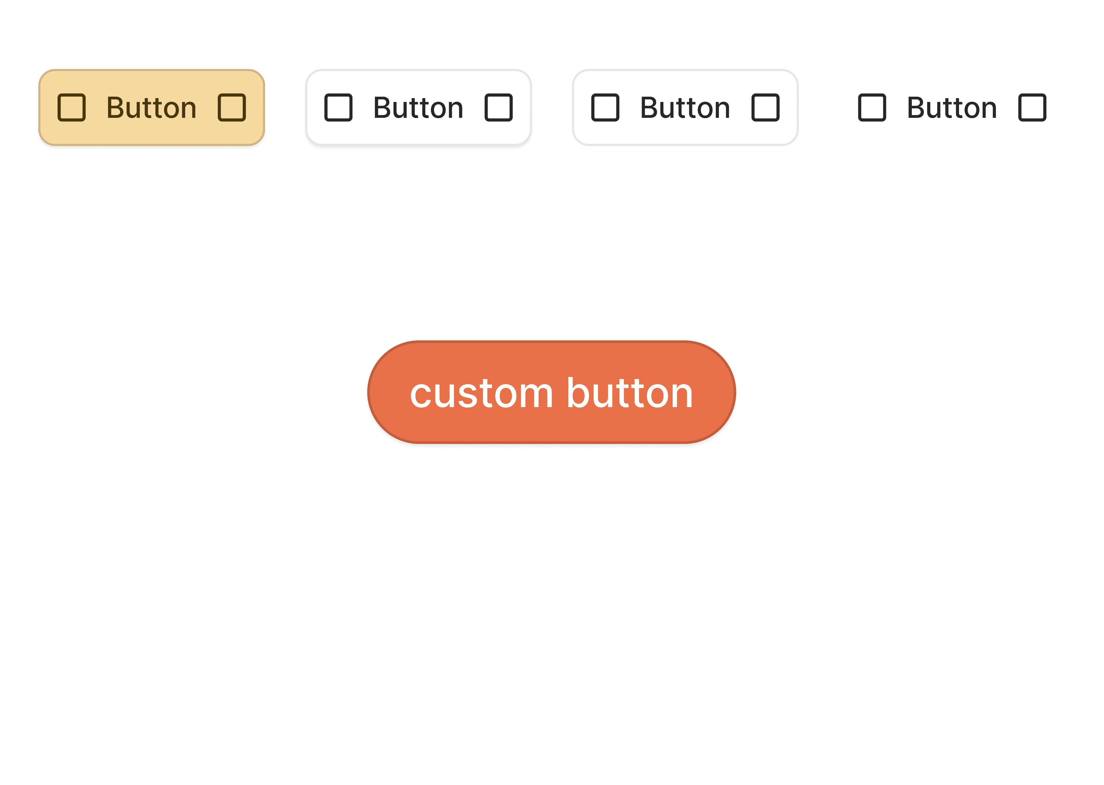
Let me share a recent scenario where I needed a custom button that didn't align with our existing button component:
Fill Color: The design called for a color that didn't match any of our predefined color tokens
Stroke: We needed a custom stroke color and width
Corner Radius: The button required a unique border radius not defined in our tokens
The Escape Hatch Approach
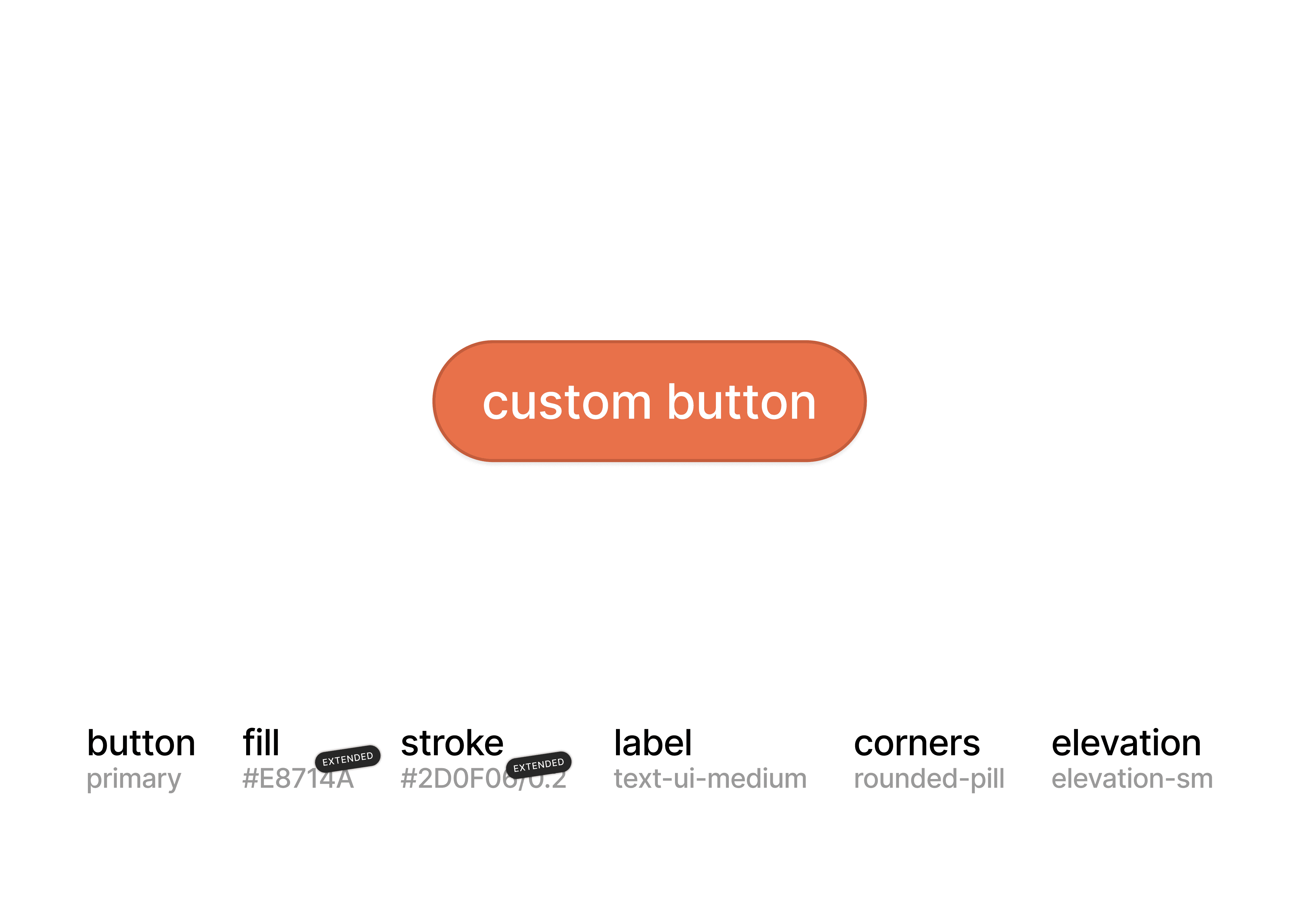
Here's how I implemented an escape hatch for our button component:
Extended Color Options: I allowed the component to accept custom color values for fill and stroke.
Fill: #E8714A (a custom color not in our token set) Stroke: #2D0F06 with 20% opacity
Custom Border Radius: I made it possible to accept a custom rounded-pill value for more rounded corners.

I ensured some attributes remained consistent with our design system:
Label: Still uses our text-ui-medium typography token
Elevation: Uses our standard elevation-sm token
This approach has allowed me to accommodate necessary customization while still maintaining a connection to our overall design system.
The Importance of Flexibility in Design Systems
Here are some strategies I've developed for building flexibility into design systems:
Modular Architecture: I build systems from small, composable parts that can be combined in various ways.
Comprehensive Variant Sets: I try to anticipate different use cases and create variants to handle them.
Extensible Tokens: I create a token structure that allows for easy addition of new values.
Clear Guidelines for Customization: I provide clear documentation on how and when to customize components.
Regular Reviews and Updates: I continuously review the design system against real-world usage and update it as needed.
Conclusion
In my experience, the key to a successful design system lies in finding the right balance between consistency and flexibility. By anticipating variants, planning for breaking points, and building in escape hatches, I've created systems that can adapt to a wide range of needs while still maintaining overall coherence.
As I look to the future, I'm excited about the potential for design systems to become even more intelligent and adaptive. I envision systems that can learn from usage patterns and suggest optimizations.
The field of design systems is constantly evolving, and that's what keeps it exciting for me. Each new project brings fresh challenges and opportunities to refine my approach. I'm committed to continuing to push the boundaries of what's possible, always with the goal of creating better, more intuitive user experiences.
In the end, I believe the true measure of a design system's success is not just in its components or documentation, but in the experiences it enables us to create. By building systems that are both robust and flexible, we set the stage for products that can delight users and stand the test of time.
aritro. 2024-2077