Building a design system at scale: Foundation and Structure
2024
Introduction
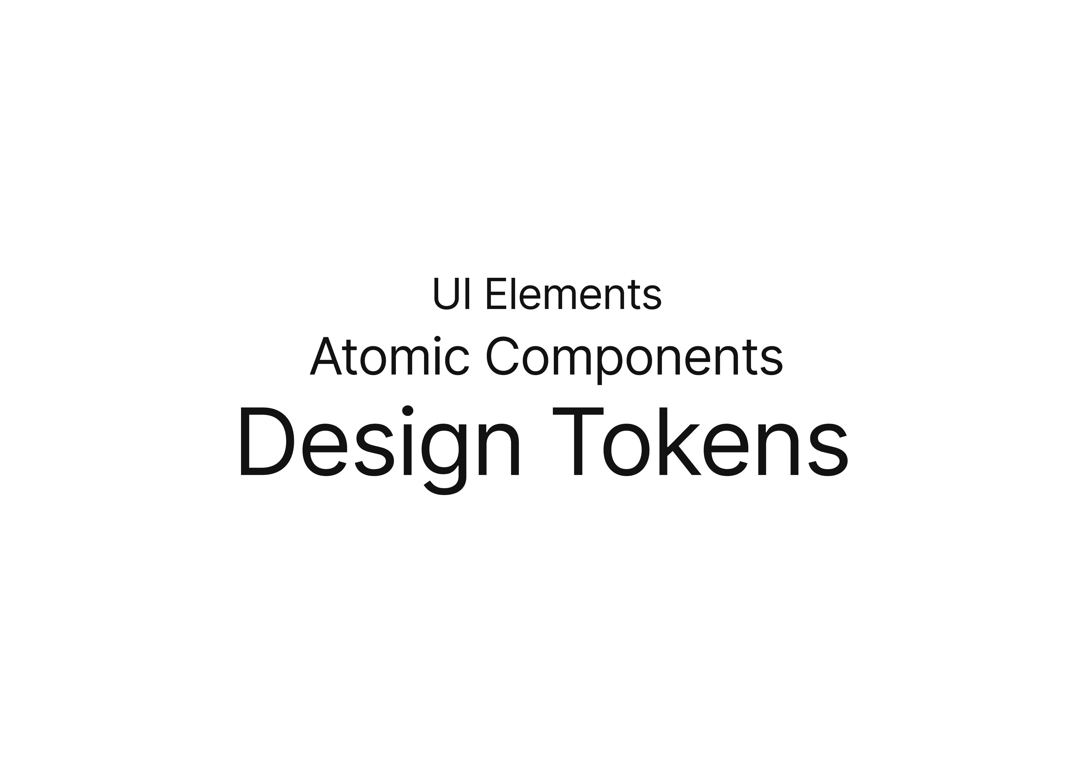
In my years as a product designer, I've witnessed the evolution of digital product design, and I've come to appreciate the crucial role that design systems play in creating consistent, scalable, and efficient user interfaces. In this series, I'll share my insights on the intricacies of design systems, focusing on the importance of breaking down components and understanding the layers that make up a robust design system. In this first part, we'll explore the foundational elements of design systems and how they contribute to creating flexible and maintainable design languages.
The Importance of Organization
From my experience, I've found that at the heart of every effective design system lies a well-structured organization. The key to building a scalable and maintainable design system is to break down its components into logical, reusable pieces. But how do we achieve this? The answer, I've discovered, lies in layering.
In my approach to design systems, layering involves breaking down the UI into distinct, hierarchical levels. Each layer builds upon the previous one, creating a system that's both modular and interconnected.

The Foundation of Your Design System
At the base of our design system pyramid are what I call design tokens. These are the most atomic elements of your design language - the fundamental values that define your visual style.
What are Design Tokens?
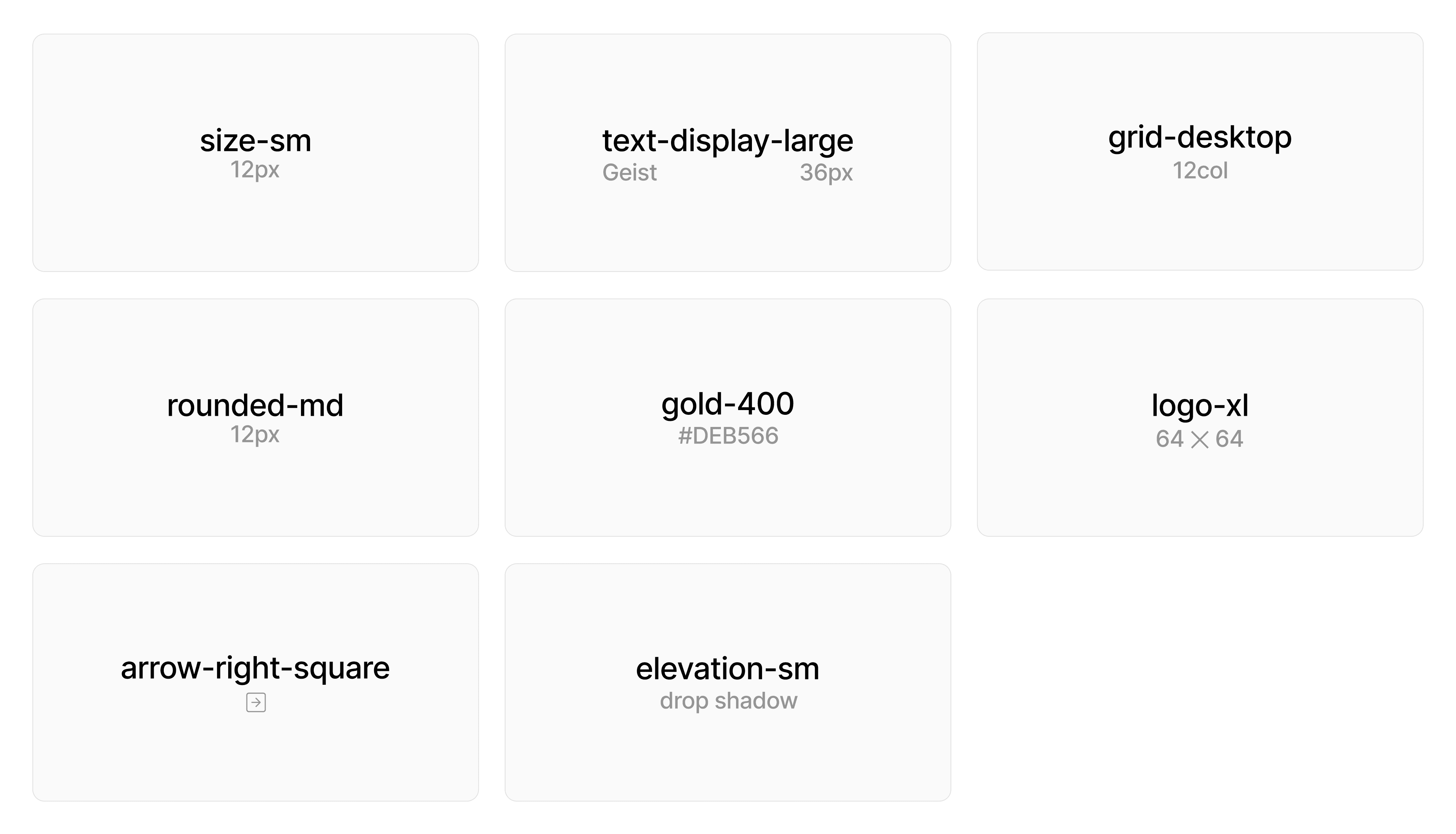
Design tokens are named entities that store visual design attributes. They form a bridge between design decisions and their implementation in code. Here are some examples of design tokens:
Color Tokens: Define your color palette, including primary, secondary, and accent colors, as well as semantic colors for things like success, warning, and error states.
Typography Tokens: Specify font families, sizes, weights, and line heights.
Spacing Tokens: Define consistent spacing units for margins, paddings, and layout grids.
Shadow Tokens: Establish a consistent elevation system with predefined shadow values.
Border Tokens: Define standard border widths, colors, and radii.

The Power of Design Tokens
Design tokens offer several advantages:
Consistency: By using tokens instead of hard-coded values, you ensure consistency across your entire product.
Flexibility: Need to update your brand colors? Just change the token values, and the changes propagate throughout your entire system.
Platform Agnosticism: Tokens can be translated into variables for various platforms (CSS custom properties, Sass variables, iOS/Android values), ensuring consistency across different codebases.
Design-Development Sync: Tokens create a shared language between designers and developers, reducing misunderstandings and implementation errors.
Building Blocks of the UI
Moving up from design tokens, we reach the level of atomic components. These are the smallest, indivisible UI elements in the system, and I build them using the design tokens.
The Importance of Atomic Components
Atomic components serve several crucial roles in a design system:
Reusability: These components can be used across various contexts in your application.
Consistency: By using the same atomic components throughout your UI, you maintain a consistent look and feel.
Efficiency: Once created, these components can be quickly implemented, speeding up the design and development process.
Maintainability: Updates to atomic components propagate throughout the entire system, making large-scale changes more manageable.
Anatomy of an Atomic Component
Let's break down a button component as an example:
Fill: Uses the gray-000 color token
Stroke: Uses the gray-200 color token
Leading Icon: Square shape
Label: Uses the text-ui-medium typography token
Trailing Icon: Square shape
Corners: Uses the rounded-sm border radius token
Elevation: Uses the elevation-focus elevation token
By building atomic components this way, I ensure they're consistent with the overall design language while remaining flexible for various contexts.

The Importance of Atomic Components
Atomic components serve several crucial roles in a design system:
Reusability: These components can be used across various contexts in your application.
Consistency: By using the same atomic components throughout your UI, you maintain a consistent look and feel.
Efficiency: Once created, these components can be quickly implemented, speeding up the design and development process.
Maintainability: Updates to atomic components propagate throughout the entire system, making large-scale changes more manageable.
Composing Complexity
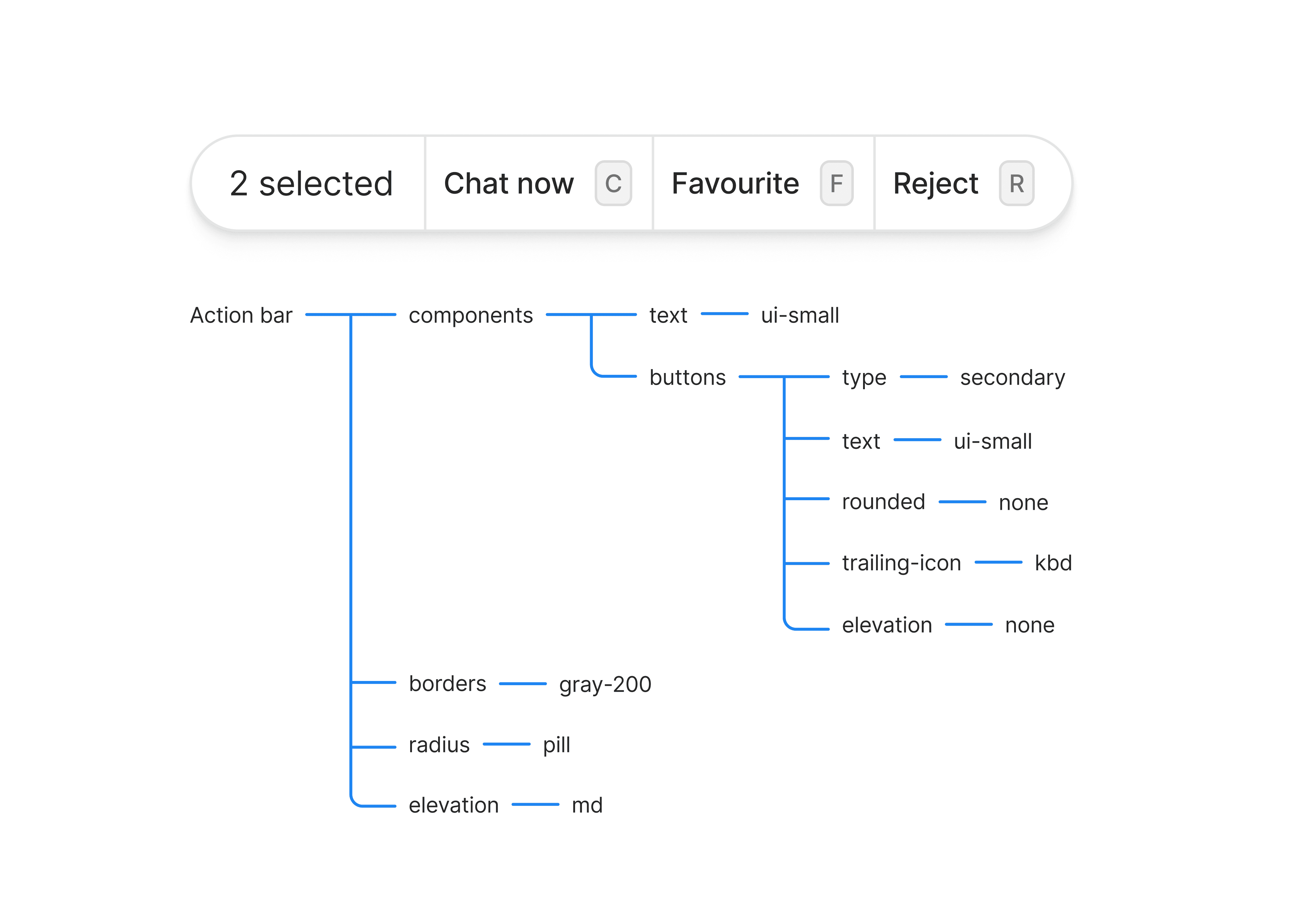
The next layer in my design system consists of UI elements. These are more complex components that I compose from multiple atomic components and additional styling.

This UI element combines multiple instances of our button atomic component, arranges them in a group, and adds additional styling and functionality.
Balancing Flexibility and Consistency
When creating molecules and organisms, it's crucial to strike a balance between flexibility and consistency. Here are some strategies:
Composition over configuration: Build smaller, focused components that can be composed into larger ones, rather than creating monolithic, highly configurable components.
Slots for flexibility: Use props to allow for variations in content and behavior without changing the core structure of the component.
Conclusion of Part 1
In this first part of our series, I've shared my approach to structuring the foundational layers of a design system. By breaking down our UI into design tokens, atomic components, and UI elements, we create a system that's both highly organized and flexible.
I've found that this layered approach offers several key benefits:
Consistency: Every element is built from the same foundational pieces, ensuring a cohesive look and feel across the entire interface.
Flexibility: If I need to make a system-wide change, I can simply update the relevant tokens, and the changes propagate throughout the entire system.
Efficiency: This structure allows me to quickly assemble interfaces using pre-built components, significantly speeding up the design process.
Scalability: As the product grows, this layered approach makes it easier to add new components that fit seamlessly into the existing system.
In the next part, we'll explore how I handle more complex scenarios, including component variants, breaking points, and strategies for maintaining flexibility while ensuring consistency. I'll also discuss some open questions and challenges I've encountered in my work with design systems. Stay tuned!
aritro. 2024-2077